Creating a visually stunning color book requires an intricate balance of color theory, paper selection, design file optimization, printing technology, and finishing techniques. This comprehensive guide will explore these critical elements to help you achieve vibrant and captivating color results for your printed books.
图片更换.webp)
Understanding Color Theory
Primary, Secondary, and Tertiary Colors
Understanding the fundamentals of color theory is essential; the primary colors (red, blue, and yellow) form the basis of all other colors. Secondary colors (green, orange, and purple) are formed by mixing primary colors. Tertiary colors are combinations of primary and secondary colors, expanding the color palette available for your designs.
Color Wheel and Complementary Colors
The color wheel visually represents colors arranged according to their chromatic relationships. Complementary colors are pairs of colors that, when combined, cancel each other out, creating a grayscale color like white or black. They make the strongest contrast and reinforce each other when placed next to each other. Understanding these relationships can help in creating striking and vibrant designs.
Warm vs. Cool Colors
Colors are often categorized as warm (reds, oranges, yellows) or cool (blues, greens, purples). Warm colors evoke energy, warmth, and excitement, while cool colors evoke calmness, tranquility, and professionalism. Balancing these colors can influence your book’s design’s overall mood and impact.
Color Psychology and Emotions
Color psychology studies how colors affect perceptions and behaviors. Different colors can evoke different emotions and reactions. For instance, red can evoke passion and urgency, while blue can induce calmness and trust. Leveraging color psychology in your book design can enhance reader engagement and emotional response.
Choosing the Right Paper
Coated vs Uncoated Paper
The choice between coated and uncoated paper significantly impacts the final look of your printed book. Coated paper has a smooth finish that enhances color vibrancy and detail sharpness, making it ideal for high-quality image reproduction. Uncoated paper is more natural textured, suitable for text-heavy pages or a more rustic aesthetic.
Paper Weight and Thickness
Paperweight is measured in GSM (grams per square meter) and affects the durability and feel of your book. Heavier papers (above 150 GSM) are thicker and sturdier, providing a premium feel and reducing bleed-through. The right paper weight is crucial for achieving your color book’s desired quality and durability.
Brightness and Opacity for Vibrant Colors
Brightness refers to the amount of light the paper reflects, with higher brightness enhancing color contrast and clarity. Opacity measures how much the paper prevents light from passing through. High opacity prevents text and images from showing through the page, ensuring a clean and professional look.
Texture (Matte vs Glossy)
The texture of your paper affects the visual and tactile experience. Matte paper provides a non-reflective surface that is easy to read and photograph, suitable for a sophisticated and elegant look. The glossy paper offers a shiny, reflective surface that enhances color depth and vibrancy, ideal for image-rich books.
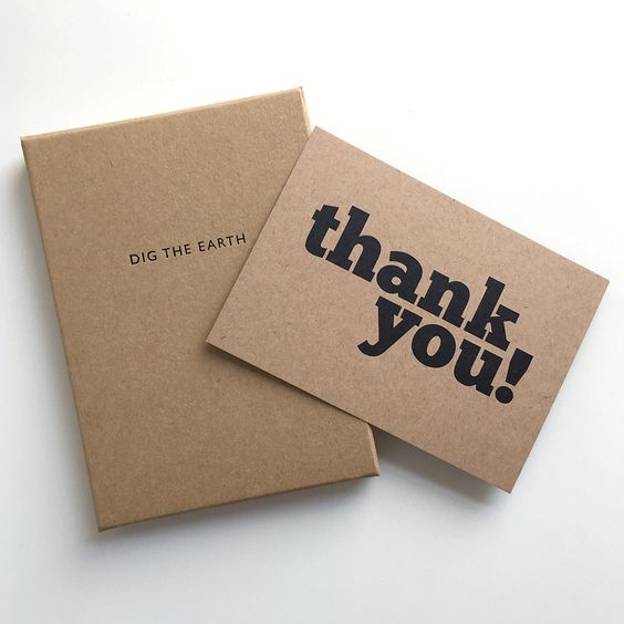
Environmentally-Friendly Options
Choosing environmentally-friendly paper options can appeal to eco-conscious readers. Look for paper that is FSC-certified (Forest Stewardship Council) or made from recycled materials. These options reduce environmental impact while maintaining high-quality printing standards.
Optimizing Your Design Files
Using High-Resolution Images
High-resolution images (at least 300 DPI) are crucial for achieving crisp and clear prints. Low-resolution images can appear pixelated and unprofessional. Ensuring your high-resolution images will enhance your book’s overall quality and visual appeal.
Adjusting Contrast and Saturation
Adjusting contrast and saturation can significantly impact the vibrancy of your printed colors. Higher contrast can make images appear sharper and more defined, while appropriate saturation levels ensure that colors are vivid without being overwhelming. Fine-tuning these settings can help achieve the desired visual effect.
Avoiding Low Resolution or Pixelated Elements
Avoid using low-resolution or pixelated elements in your design. These can detract from the overall quality and professionalism of your book. Always check the resolution of your design elements and replace any that do not meet the necessary standards.
Color Profiles and Color Management
Utilize color profiles such as CMYK for print to ensure color accuracy. Color management involves controlling how colors are represented across different devices and media. Using standardized color profiles ensures that the colors in your design are reproduced accurately in print.
Printing Technologies
Offset Printing for Large Runs
Offset printing is ideal for large print runs, offering consistent, high-quality results and cost-effectiveness. This traditional printing method provides excellent color accuracy and vibrancy, making it suitable for professional-grade color books.
Digital Printing for Shorter Runs
Digital printing is a flexible and cost-effective option for shorter print runs. It allows for quick turnaround times and the ability to print on demand. While it may not match the color precision of offset printing, advancements in digital printing technology have significantly improved its quality.
Spot Colors vs CMYK
Spot colors are pre-mixed inks used in specific areas of a print job to achieve colors that cannot be accurately reproduced with the standard CMYK process. CMYK printing uses four colors (cyan, magenta, yellow, and black) to create various colors. Choosing between spot colors and CMYK depends on your color accuracy requirements and budget.
Proofing and Color Matching
Proofing involves creating a sample print to check color accuracy and quality before the final print run. Color matching ensures that the colors in your design appear as intended in the final product. Requesting proof allows you to make necessary adjustments and avoid costly mistakes.
Binding and Finishing
Perfect Binding vs Saddle Stitch
Perfect binding involves gluing the pages together at the spine, creating a flat spine that can be printed on. This method is ideal for thicker books. Saddle stitch binding involves stapling the pages along the fold line, which is suitable for thinner books or booklets.
Lamination Options (Matte vs Glossy)
Lamination adds a protective layer to the cover of your book, enhancing durability and aesthetic appeal. Matte lamination provides a smooth, non-reflective finish that feels sophisticated. Glossy lamination offers a shiny, reflective finish that enhances color vibrancy and attracts attention.
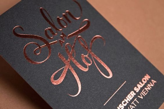
Embossing and Foil Stamping
Embossing creates a raised texture on the cover, adding a tactile and visual element. Foil stamping applies metallic or pigmented foil to the cover, creating eye-catching accents. These finishing techniques can add a luxurious and premium feel to your book.
Considerations for Lay-Flat Binding
Lay-flat binding allows the book to open completely flat without damaging the spine. This is particularly useful for design-intensive books where double-page spreads must be viewed seamlessly. Consider this option for high-quality presentation and user experience.
Testing and Quality Control
Requesting Press Proofs
Before committing to a full print run, requesting press proofs allows you to check the quality and accuracy of your book. This step is crucial for identifying any issues and making necessary adjustments before final production.
Checking for Color Consistency
Checking for color consistency throughout the print run ensures that all copies of your book look the same. Color variations can occur due to differences in paper, ink, and printing conditions. Regular checks help maintain uniformity and quality.
Evaluating Vibrancy and Richness
Evaluating vibrancy and richness involves assessing the overall impact of the colors in your book. The colors should be vivid and true to your design without appearing washed out or overly saturated. This evaluation helps ensure that your final product is visually appealing.
Making Adjustments as Needed
If any issues are identified during testing, adjusting your design files, printing settings, or paper choice can rectify these problems. Continuous quality control ensures that the final product meets your expectations and standards.
Conclusion
By understanding color theory, selecting the appropriate paper, optimizing your design files, choosing the right printing technology, considering binding options, and implementing rigorous testing, we at Tina Hong Paper Printing Limited Company, a professional printing solutions provider, offer unparalleled expertise and cutting-edge services to achieve vibrant and eye-catching color results for your printed books. Our commitment to quality ensures that every project meets the highest standards, reflecting our company’s strength and dedication to excellence in the industry.